


Getting Started
Let’s start with learning how we can include CSS in our projects. There are typically three ways we do that.
1. Inline CSS
First off, we can include CSS directly in our HTML elements. For this, we make use of the style attribute and then we provide properties to it.
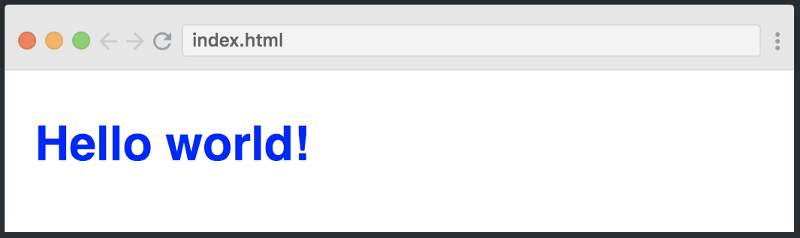
<h1 style="color: blue"> Hello world! </h1>
Here we’re giving it the property of color, and setting the value to blue, which results in the following:
We can also set multiple properties inside the style tag if we wanted. However, I don’t want to continue down this path, as things start to get messy if our HTML is cluttered with lots of CSS inside it.
This is why the second method to include CSS was introduced.
2. Internal CSS
The other way to include CSS is using the style element in the head section of the HTML document. This is called internal styling.
<head>
   <style>
       h1 {
	   color: blue;
       }
   </style>
</head>
In the style element, we can give the styling to our HTML elements by selecting the element(s) and provide styling attributes. Just like we applied thecolorproperty to the h1 element above.
3. External CSS
The third and most recommended way to include CSS is using an external stylesheet. We create a stylesheet with a .css extension and include its link in the HTML document, like this:
<head>
	<link rel="stylesheet" href="style.css">
</head>
In the code above, we have included the link of style.css file using the link element. We then write all of our CSS in a separate stylesheet called style.css so that it’s easily manageable.
h1 {
	color: blue;
}
This stylesheet can also be imported into other HTML files, so this is great for reusability.
Breakpoints for Media Queries
There are tons of screens and devices with different heights and widths, so it is hard to create an exact breakpoint for each device. These breakpoints can differ and there is no standard exactly defined, but these are some commonly used ones.
1. Mobile Portrait View
Mostly looked at Apple devices. While Android-based devices are important too, they have a lot of variances in most phones.
/* Mobile view */
@media only screen and (max-width: 480px) and (min-width: 320px) {
    body {
        padding: 0 6% 6% 6%;
    }
    h1 {
        font-size: 42px;
    }
    h2 {
        font-size: 38px;
    }
    h3 {
        font-size: 35px;
    }
    h4 {
        font-size: 30px;
    }
    h5 {
        font-size: 28px;
    }
    h6 {
        font-size: 25px;
    }
    p {
        font-size: 15px;
        margin-bottom: 5px;
    }
}
2. Mobile Landscape and Tablet Portrait View
Mostly looked at Apple devices. While Android-based devices are important too, they have a lot of variances in most phones.
/* Mobile landscape and Ipad portrait view */
@media only screen and (max-width: 768px) and (min-width: 481px) {
    body {
        padding: 0 6% 6% 6%;
    }
    h1 {
        font-size: 42px;
    }
    h2 {
        font-size: 38px;
    }
    h3 {
        font-size: 35px;
    }
    h4 {
        font-size: 30px;
    }
    h5 {
        font-size: 28px;
    }
    h6 {
        font-size: 25px;
    }
    p {
        font-size: 15px;
        margin-bottom: 5px;
    }
}
3. Tablet Portrait and Landscape View
Mostly looked at Apple devices. While Android-based devices are important too, they have a lot of variances in most phones.
/* iPad portrait and landscape view */
@media only screen and (max-width: 1024px) and (min-width: 769px)
    body {
        padding: 0 6% 6% 6%;
    }
    h1 {
        font-size: 42px;
    }
    h2 {
        font-size: 38px;
    }
    h3 {
        font-size: 35px;
    }
    h4 {
        font-size: 30px;
    }
    h5 {
        font-size: 28px;
    }
    h6 {
        font-size: 25px;
    }
    p {
        font-size: 15px;
        margin-bottom: 5px;
    }
}
4. Small screen Laptop View
Mostly looked at Apple devices. While Android-based devices are important too, they have a lot of variances in most phones.
/* Small screens, laptops. view */
@media only screen and (max-width: 1200px) and (min-width: 1025px ){
    body {
        padding: 0 6% 6% 6%;
    }
    h1 {
        font-size: 42px;
    }
    h2 {
        font-size: 38px;
    }
    h3 {
        font-size: 35px;
    }
    h4 {
        font-size: 30px;
    }
    h5 {
        font-size: 28px;
    }
    h6 {
        font-size: 25px;
    }
    p {
        font-size: 15px;
        margin-bottom: 5px;
    }
}
5. Desktops and Large screen View
Mostly looked at Apple devices. While Android-based devices are important too, they have a lot of variances in most phones.
/* Desktops, large screens. view */
@media only screen and (min-width: 1201px  ){
    body {
        padding: 0 6% 6% 6%;
    }
    h1 {
        font-size: 42px;
    }
    h2 {
        font-size: 38px;
    }
    h3 {
        font-size: 35px;
    }
    h4 {
        font-size: 30px;
    }
    h5 {
        font-size: 28px;
    }
    h6 {
        font-size: 25px;
    }
    p {
        font-size: 15px;
        margin-bottom: 5px;
    }
}